Skip to content
← Work Tateossian

E-commerce redesign · London

Redesigning luxury
for the mobile era

Tateossian — one of London's leading men's accessories brands — needed its e-commerce experience rebuilt from the ground up. The brief was clear: mobile-first, cleaner hierarchy, and a design that let the product speak.

Mobile-firstDesign approach
GlobalRetail research
End-to-endBrand & UX
Role
Branding · Identity · Web Design · UX/UI
Client
Tateossian London
Focus
E-commerce · Mobile-first
Read the case study

The brand was premium. The website wasn't. At Tateossian's price point, a cluttered mobile experience doesn't just lose a sale — it actively damages the perception of quality that justifies the price. The redesign had to fix the experience and close that gap simultaneously.

Three things were genuinely non-negotiable — and they were set before I opened Figma. The navigation had to work for someone who didn't already know the product range. Mobile had to feel like a considered experience, not a scaled-down afterthought. And the design had to earn the price tag — at Tateossian's price point, visual noise is a trust problem, not an aesthetic one.

Mobile-first, not mobile-adapted

The old site was designed for desktop and squeezed onto mobile. Every interaction — browsing, filtering, purchasing — needed to be rethought from a handheld perspective first.

Luxury without visual noise

Premium brands need space to breathe. The existing design was cluttered — too many competing elements, inconsistent typography, and product photography that wasn't given room to shine.

Global retail complexity

Tateossian sells through boutiques in multiple countries. The platform needed to handle currency, regional product availability, and retailer needs — without adding complexity for the end customer.

Conversion across the funnel

From product discovery through to checkout, every step had friction that was losing customers. The journey needed to be radically simplified without losing the brand's editorial quality.
The fastest route to the right brief was talking to the people closest to customers. Retail managers across four regions were fielding the same questions from customers every day — questions the website should have answered. Four consistent findings shaped every subsequent design decision.

Finding 01 — navigation

"Customers come in asking for specific products they saw online — but they couldn't find them again to buy."

The catalogue was deep but the navigation was shallow. Users couldn't browse efficiently without already knowing what they were looking for. This made the mega-menu and filtering system the first redesign priority.

Finding 02 — mobile

"Most of our customers are on their phones when they browse. The site just doesn't work on mobile."

This was consistent across every region. Analytics confirmed it. Mobile-first stopped being a preference and became a hard constraint — every layout decision had to be validated on a small screen first.

Finding 03 — gifting

"People often want something for a gift but have no idea where to start — the site doesn't help with that."

Gift intent was a significant purchase motivation but the site had no gift-oriented entry point or filtering. This surfaced as a content and IA problem — and shaped how we structured category pages and editorial zones.

Finding 04 — trust

"At this price point, customers expect the website to feel as premium as the product."

The existing site didn't meet that expectation. Visual noise, inconsistent typography, and cluttered layouts actively undermined trust at high price points. Cleanliness became a brand signal, not an aesthetic preference.

Method

Retail manager interviews

In-depth conversations with managers across Tateossian boutiques worldwide surfaced patterns in customer behaviour, common questions, and friction points that the site wasn't resolving — pushing people to call or visit in person.

Method

Customer journey mapping

We mapped the end-to-end online journey — from first visit through product discovery, selection, and checkout — identifying every point where users were dropping off or contacting support unnecessarily.

Finding

Mobile was the majority channel

Retail managers confirmed what analytics suggested: most customers were browsing on tablet or mobile, but the experience on those devices was inadequate. This made the mobile-first decision non-negotiable.

Finding

Product discovery was the biggest drop-off

Users couldn't efficiently navigate the breadth of Tateossian's catalogue. The mega-menu and filtering system were identified as the highest-priority redesign areas for improving conversion.

Three things had to be non-negotiable. Not as aesthetic preferences — as hard constraints that I applied to every layout and interaction decision, from the navigation architecture to the smallest product card detail.

01

Mobile first — not mobile last

Every layout, navigation pattern, and interaction was designed for a small screen first. Desktop was an enhancement of the mobile experience, not the other way around. This meant rethinking the mega-menu, filters, product grids, and checkout flow entirely.

Led to: new mobile navigation system, swipe-friendly product browsing, thumb-zone-aware CTAs
02

Cleanliness as a brand signal

For a luxury brand, white space is not wasted space — it's a signal of quality. We removed visual noise ruthlessly: fewer typefaces, consistent spacing, a restrained dark palette that made the product photography pop rather than compete with the interface.

Led to: editorial hero layout, reduced navigation complexity, full-bleed product imagery
03

Hierarchy that serves the shopper

The previous site made every product and category feel equally important — which meant nothing stood out. We established a clear hierarchy: hero products, featured collections, then the full catalogue — guiding users through a curated experience rather than overwhelming them with choice from the first scroll.

Led to: structured homepage zones, progressive disclosure in navigation, curated collection landing pages

The push: The brief asked for "everything visible on the homepage". I made the case — backed by the retail manager findings — that trying to show everything was exactly what was burying the products people came to find. A more editorial approach was signed off after we tested both with the client team.

Desktop

Redesigning for clarity and luxury

A clean, hierarchy-driven experience that lets the product photography do the work — on every device.

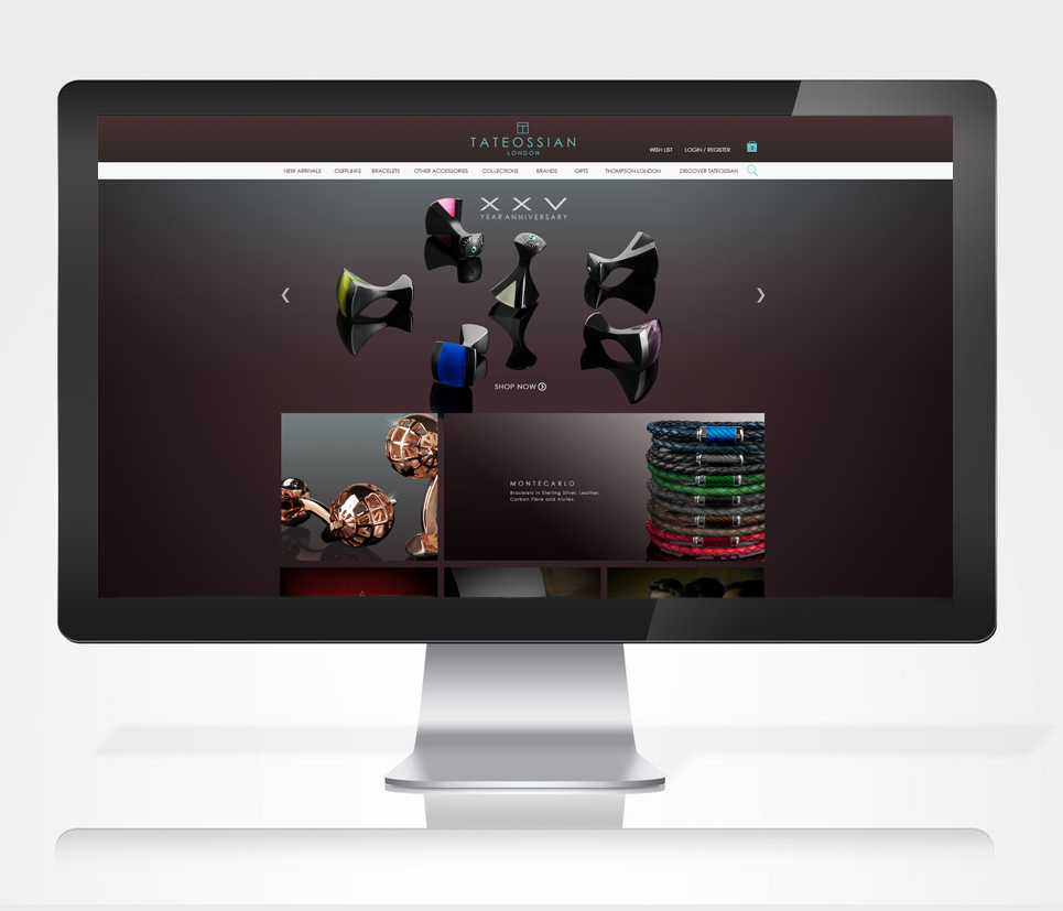
Tateossian homepage redesign

Homepage — editorial hero with product carousel and prominent navigation

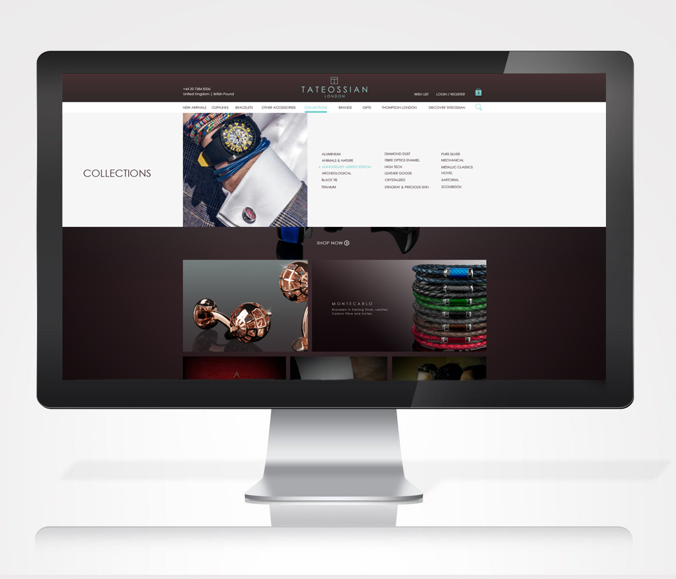
Collections mega-menu

Collections with mega-menu navigation

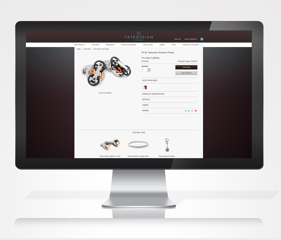
Product detail page

Product detail page — clean layout, clear purchase flow

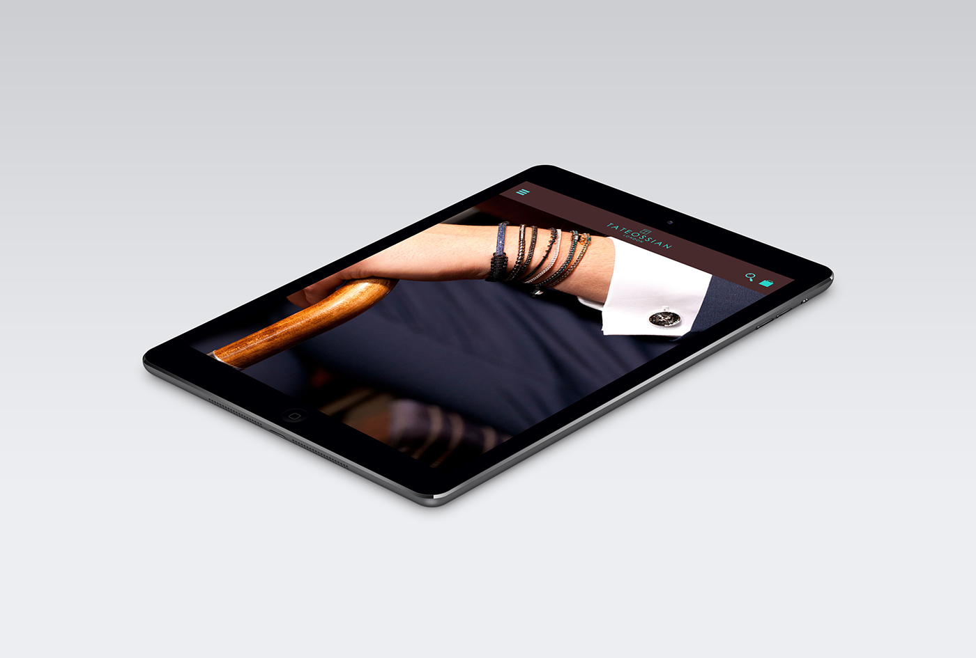
Mobile hero — lifestyle photography
Mobile first

Designed for the hand — from the start

The mobile-first decision was made before a single pixel was placed. Retail managers confirmed the majority of their customers were browsing on tablet and mobile — so those surfaces had to be flawless, not afterthoughts.

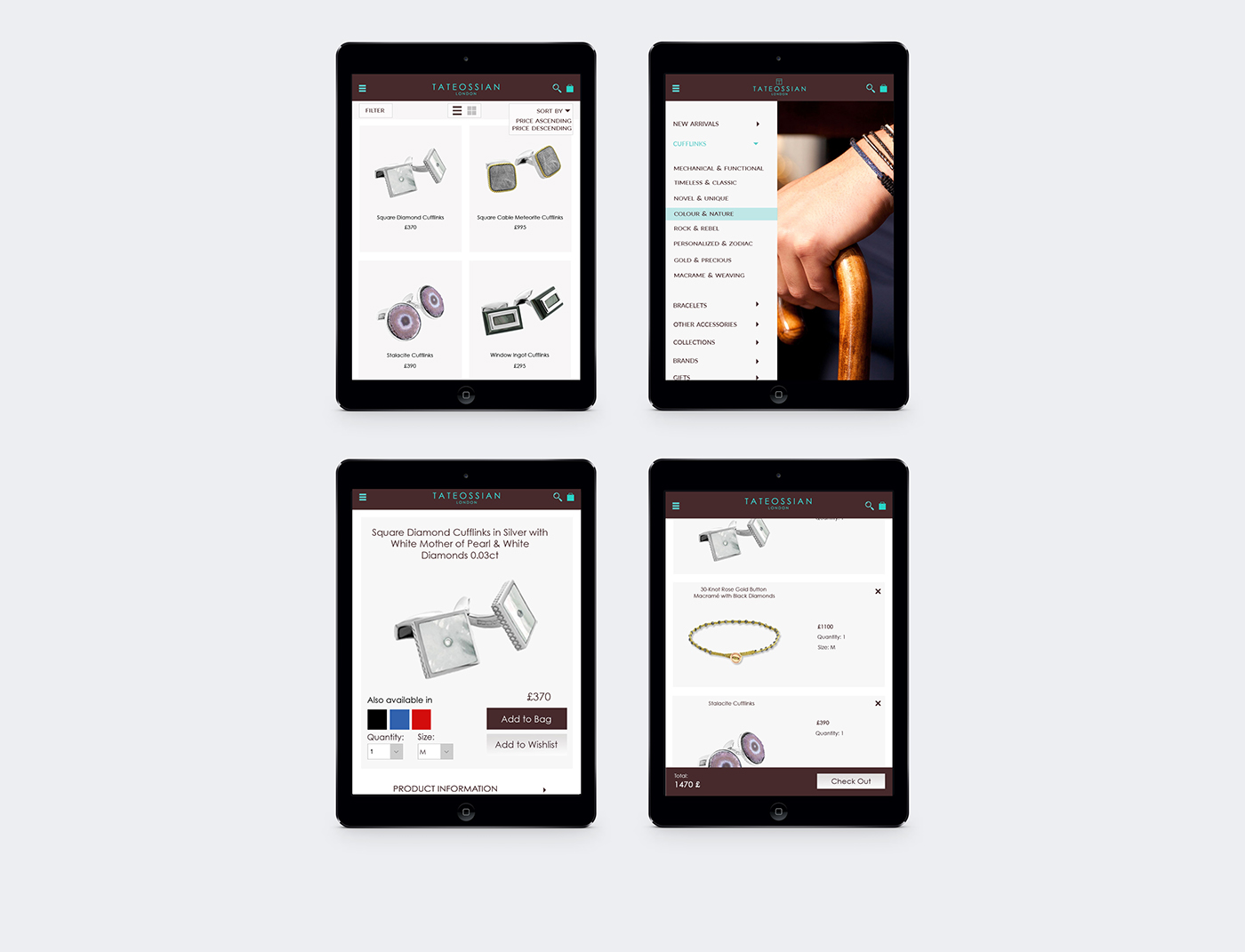
Four mobile screens — listing, navigation, product detail, bag

Product listing · Category navigation · Product detail · Bag — mobile flows designed as a continuous, frictionless journey

Four concrete changes came directly from the design work — not from general platform improvements, but from specific decisions made against specific research findings.

375px

Every layout validated mobile-first before scaling up

1st

Version of the site that actually worked on a phone

✓

Visual language adopted as the brand's digital standard

Approach

Mobile first — not mobile as an afterthought

Every layout was validated on a 375px screen before scaling up. Desktop was the adaptation, not the starting point.

Navigation

Mega-menu killed the "I can't find it" pattern

The new structured menu was validated against the specific navigation failures in research. Retail managers confirmed it matched how customers describe products in-store.

Mobile experience

A complete, thumb-friendly purchase flow

The previous site had no intentional mobile experience. Browsing, filtering, and checkout were tested on Tateossian's most common device/OS combinations.

Brand alignment

Signed off as "finally matching the product quality"

The restrained palette, editorial typography, and full-bleed photography were formally adopted as the brand's digital visual standard.

Luxury requires restraint

The temptation with premium brands is to add more — more gold, more effects, more visual complexity. The opposite is usually true. The most effective luxury experiences remove everything that competes with the product itself.

Research from the field beats assumptions

The retail manager interviews revealed pain points we hadn't anticipated — particularly around size guides, gifting flows, and regional product availability. Insights from people closest to customers are irreplaceable.

Mobile-first changes how you think about navigation

Desktop mega-menus are a shortcut for complex taxonomies. On mobile they're a disaster. Redesigning the navigation for mobile first forced clearer thinking about information architecture that made the desktop version better too.

Brand and UX are the same conversation

Working across branding, identity, and UX in the same project made clear how inseparable these disciplines are at a brand level. Typography choices are UX choices. Colour decisions affect trust. Every visual decision has a functional consequence.

The broader lesson

E-commerce for luxury brands isn't just about selling — it's about maintaining the brand contract with every click. A confusing checkout or a cluttered PDP doesn't just lose a sale; it damages the perception of quality that justifies the price. Design has to carry both the conversion and the brand.