Skip to content
← Work Lottoland

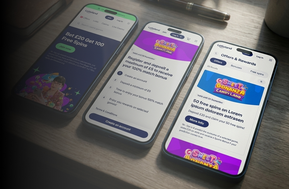
Offer experience redesign

Redesigning promotion journeys
for clarity and engagement

Using UX research to streamline how users discover and interact with bonuses — improving retention, clarity and trust across key journeys.

Clearer journeysOffer experience
Sharp dropSupport load
Higher engagementBonus usage
Role
Senior Product Designer
Company
Lottoland.com
Focus
Promotions & bonuses
Methods
Research · Testing · A/B
Read the case study

When I joined the offer experience at Lottoland, it had grown organically — and it showed. Scattered promotions, inconsistent copy, and unclear mechanics created a journey that felt confusing and untrustworthy. Users were abandoning before claiming, contacting support for answers they shouldn't have needed, and disengaging from a system designed to keep them active.

My first job wasn't to design — it was to figure out why the system had stopped working for the people using it.

Unclear offer mechanics

Terms were buried or written in legal language. Users didn't know what action was needed to claim — or whether they were even eligible.

No personalisation

Every user saw the same generic promotions. High-value users got no more relevance than first-time visitors — and felt it.

Fragmented journeys

Discovery, activation, and reward tracking lived in different places with no connecting flow. Users had to piece together the experience themselves.

Information overload

Too many promotions presented at once created decision fatigue. The system rewarded patience over clarity — and most users didn't have patience.

No progress tracking

Users couldn't see how close they were to a reward milestone. Without feedback, they assumed the system wasn't working — and stopped trying.

No bonus history

After using a bonus, it disappeared. Users couldn't revisit what they'd claimed, leading to repeated support contacts and distrust in the system.
Users were dropping out before claiming. Analytics showed where — research told us why. I ran three phases, each designed to answer a different question: what users experienced, what direction would fix it, and whether it actually did.

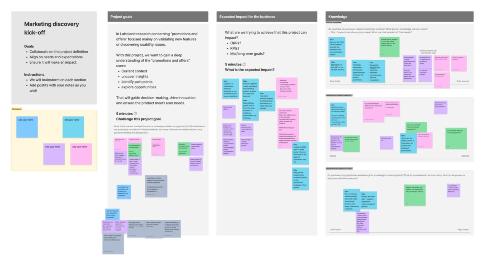
Before any research or design, I facilitated the discovery kick-off — a working session with stakeholders across business, product and technology. The goal was to agree on what this project needed to achieve, surface what we already knew, and write down the assumptions we were carrying so the research could test them rather than inherit them.

Marketing discovery — kick-off board
Discovery kick-off board: project goals, expected business impact, existing knowledge, open questions and hypotheses captured with stakeholders

The board I ran the session on: project goals, expected business impact, existing knowledge, the open questions to answer, and the hypotheses to prove or disprove. Aligning on these first is what kept the research focused — and gave the work buy-in from the wider business before a single screen was designed. Sticky-note detail is intentionally blurred — the project is under NDA.

Understanding why users dropped off

Qualitative

I talked to 7 users — new players and existing ones, across different engagement levels. The goal wasn't to confirm assumptions. It was to map every moment where the offer journey stopped making sense: the confusion, the hesitation, the small thing that made someone give up and close the tab.

7Interviews
2User types
5Key insights
Think-aloud New & existing players Mixed engagement

What came out

Five design problems ranked by frequency and severity. Insight 02 — decision fatigue from too many offers — came out as the highest-priority finding, and the one that directly contradicted what the business wanted to do.

Important distinction

These interviews shaped the design direction. The outcome numbers in the results section come from A/B tests and post-launch analytics — not from this sample of 7 people.

Validating a direction before building anything

Qualitative

I went back to users with three rough concepts. No polished UI — just enough to test whether the ideas made sense to real people. This was the phase where the "fewer offers" hypothesis was tested for the first time, and where I built the evidence I needed to defend it against the instinct to surface more.

3Concepts tested
1Direction chosen
0Lines of code written
Concept testing Preference testing Stakeholder alignment

What came out

A single validated direction — signed off by the business. Engineering commitment only came after user testing confirmed the approach. That sequencing matters: the hardest conversation (fewer offers) was settled before a single component was built.

Measuring whether it actually worked

Quantitative

Built the UI patterns and ran structured A/B experiments on live traffic. Each test was designed to answer one specific question — tooltip messaging, step flow structure, how eligibility was surfaced. Six weeks of post-launch analytics gave enough data to see real behavioural change, not just initial novelty.

A/BMethod
6 wksAnalytics window
LiveProduction traffic
A/B testing Tooltip variants Step flow variants Eligibility display

What came out

Every A/B variant outperformed the control. Bonus completion up. Support contacts down. Offer conversion improved across every tested surface. The qualitative hypothesis was validated at scale — and the numbers are in the Results section.

I came out of the interviews with three distinct user types — but what mattered wasn't the archetypes, it was the principle they forced. Every design decision had to hold up for the user with the least trust in the platform. Designing for the skeptic meant every other user was already covered.

The Light Explorer

Seeks quick wins

"I saw there was a bonus but I didn't understand what I had to do to get it."

NeedsSimple, fast access to bonus info. No steps to decode.
FrustrationDoesn't understand what action triggers the claim. Gives up and moves on.
Design priorityClear one-step CTAs. Eligibility surfaced upfront.

The Value Seeker

Motivated by tailored offers

"If the offer isn't for my games I just ignore it. I want something that's actually for me."

NeedsRelevant offers tied to favourite games or preferred play patterns.
FrustrationOffers feel generic or repetitive. Stops reading them entirely.
Design priorityPersonalised offer copy. Game-linked promotion surfacing.

The Bonus Maximiser

Focused on rewards

"I want to see all my bonuses in one place — what I have, what I've used, what I'm close to."

NeedsClear tracking of active rewards, pending bonuses, and history.
FrustrationNo clarity on used or unused bonuses. Contacts support repeatedly.
Design priorityBonus wallet with status tracking and history view.

Five things kept coming up across every interview, regardless of user type or engagement level. These weren't assumptions I brought in — they were the reasons users stopped short of claiming. Every design decision was tested against them. If a solution didn't address at least one, it wasn't a solution.

01

Clarity builds trust

Users hesitate when offer mechanics are vague or steps are unclear. Confusion doesn't just cause drop-off — it creates a lasting distrust of the platform's intent.

Drove: step-by-step offer UI and progressive disclosure of terms
02

Too many offers creates decision fatigue

Users want fewer, better-targeted promotions. Presented with 8+ offers, they either chose randomly or abandoned entirely. Fewer, higher-relevance offers outperformed volume in every test.

Drove: personalisation logic and offer prioritisation

The business instinct was to surface more offers. I used the research to argue the opposite — and reducing the offer count won in every A/B variant we ran. That was the decision that needed defending.

03

Promotions ≠ Offers — users knew the difference

Users consistently separated "things the platform gives me" (offers) from "things I've earned" (bonuses). Using the terms interchangeably broke their mental model and caused navigation errors.

Drove: unified copy system and terminology audit
04

Progress tracking sustains engagement

Users needed to see how close they were to claiming a bonus. Without visible progress, they assumed the system wasn't registering their activity — and stopped engaging with it.

Drove: progress indicators and milestone notifications
05

Bonus history matters for trust

Users wanted a record of what they'd used and when. Its absence made the system feel untrustworthy — "did it actually work?" — and drove repeat support contacts.

Drove: bonus wallet with history view

I owned the design end-to-end, but the decisions that mattered most were about what not to build. With limited engineering capacity, I prioritised these five changes because they each addressed a root cause — not a surface symptom.

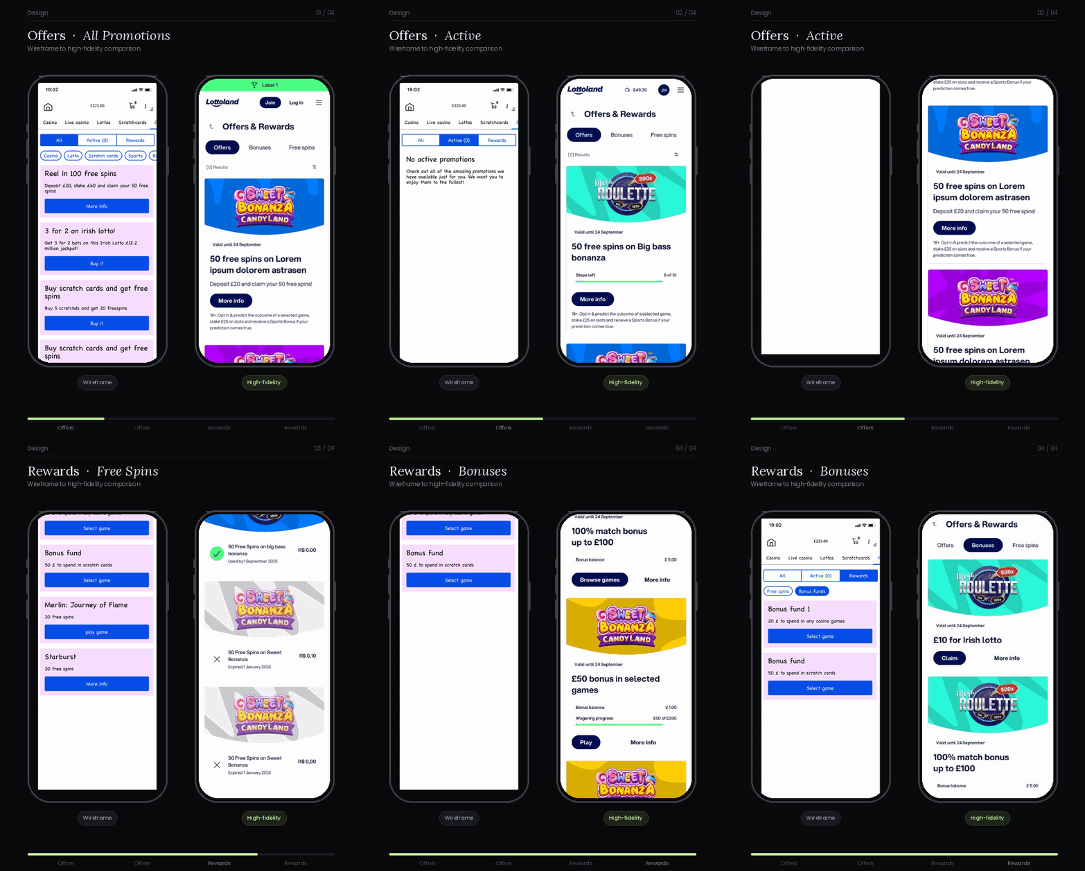
Unified offer hub — centralised promotions with status filtering
01 — Unified offer hub

All promotions in one place

Centralised every active, pending, and available promotion into a single clearly labelled hub. Users could filter by status, see what they were eligible for, and navigate without guessing which section held what.

The decision: The business wanted promotions surfaced across multiple entry points. I pushed back — fragmentation was the problem we were solving. One hub, with clear status labels, won in every test variant.

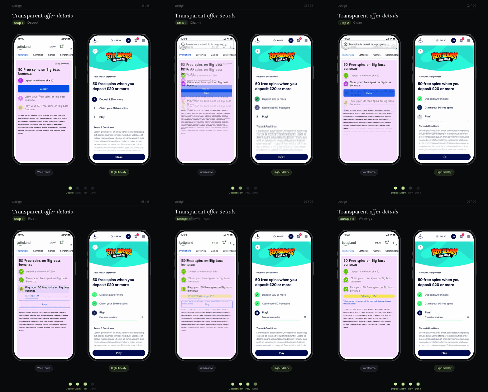
Transparent offer details — clear steps, progress and simplified terms
02 — Transparent offer details

Steps, progress, plain language

Each offer now shows what the user needs to do, where they are in the process, and what they'll receive — with terms simplified and expandable rather than buried in a wall of legal text.

The decision: The original flow dropped everything on the user at once — eligibility, requirements, deadlines — with no sense of order. I broke claiming into visible steps so users always knew what they'd done, what was left, and what they'd get. Making the path explicit turned an opaque process into one users could actually finish.

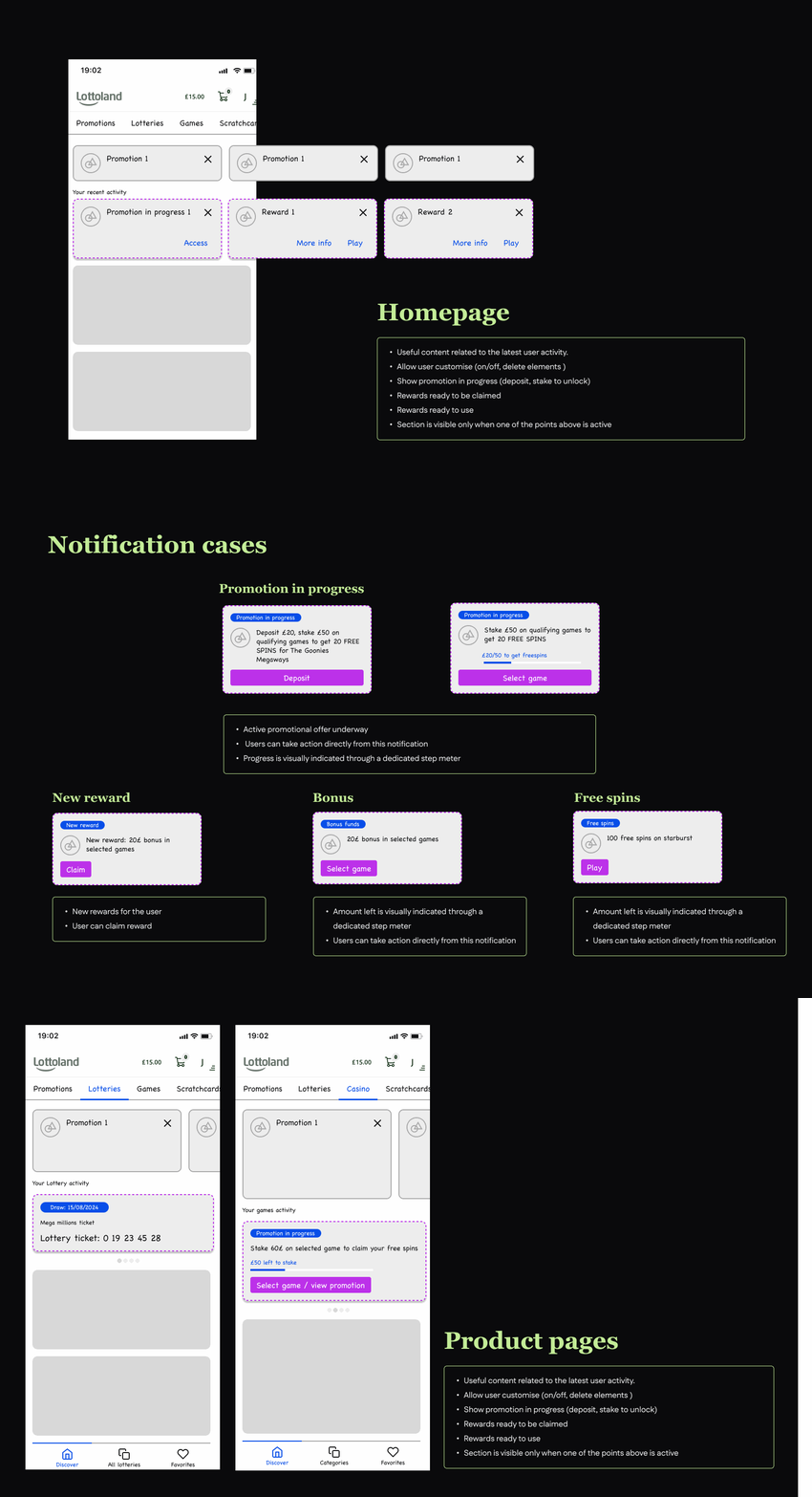
Smart notifications — contextual prompts at the right moment
03 — Smart notifications

The right signal at the right moment

Contextual prompts surface when a user unlocks a bonus, gets one step closer to a milestone, or when a game they're on supports an active promotion — not as bulk pushes, but as relevant, timely information.

The decision: The first instinct was to increase notification frequency. Research pointed the other way — users were ignoring notifications because they felt irrelevant. Fewer, context-triggered messages performed better.

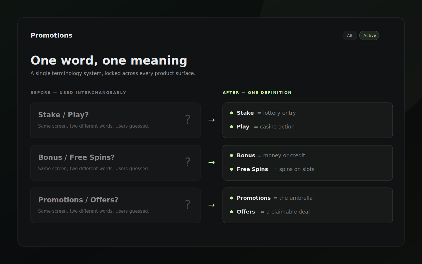
Aligned copy system — consistent terminology across journeys
04 — Aligned copy system

One word, one meaning

Stake vs Play. Bonus vs Free Spins. Promotions vs Offers. The platform used these terms interchangeably — and users told us they couldn't tell what they were claiming. We standardised terminology across every surface, collaborating with content and legal teams to lock in definitions.

The decision: This was the lowest-tech fix and had the highest impact on support ticket reduction. Language inconsistency was producing more confusion than any UI problem.

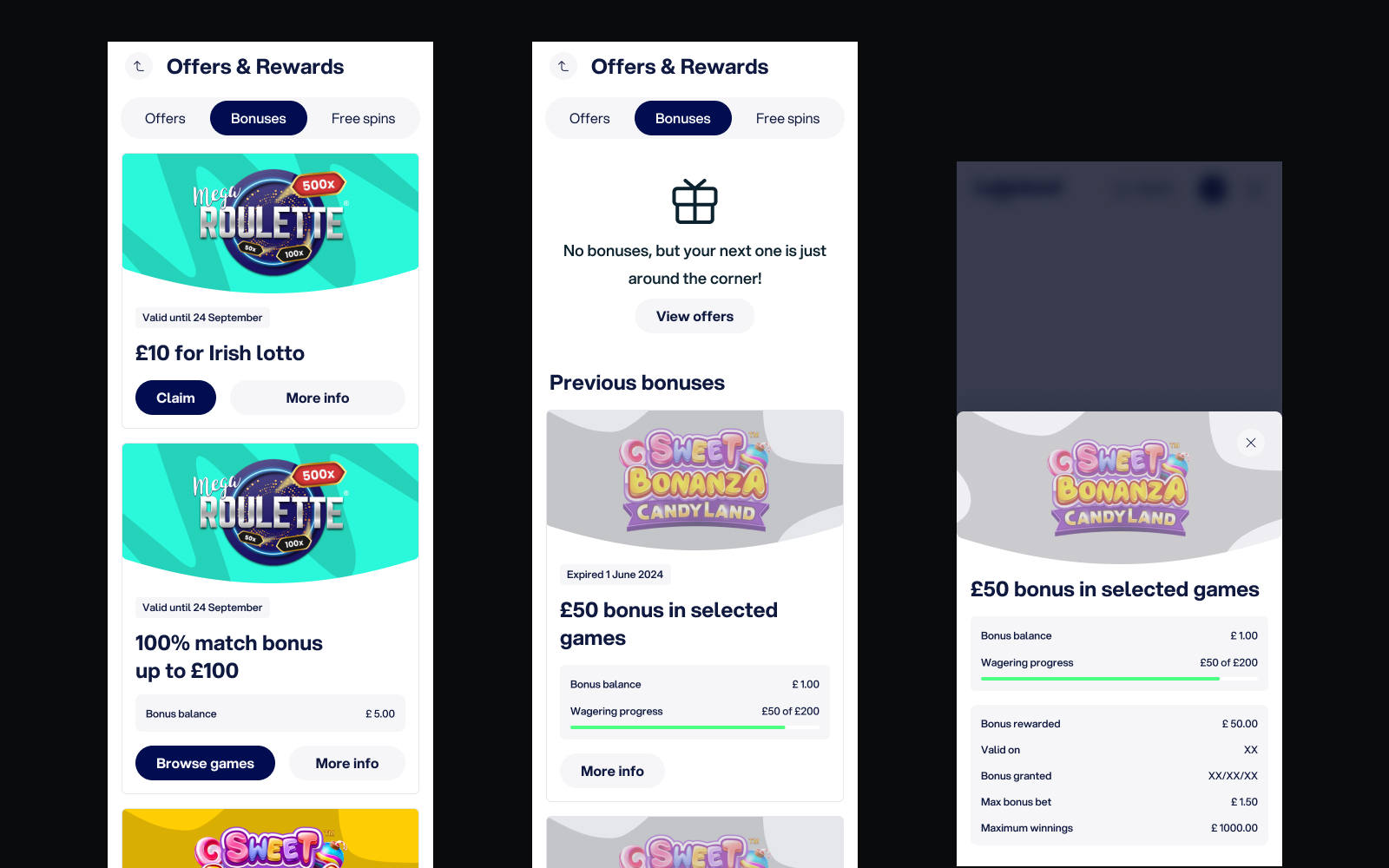
Bonus wallet — active, pending and used bonuses with game links
05 — Bonus wallet

Bonuses you can actually track

New wallet UI surfaces active, pending, and used bonuses — with direct links to eligible games and a clear path to support when something isn't right. Used bonuses previously disappeared; now users have a history they can trust.

The decision: Showing used bonuses was initially considered "clutter". Research showed the opposite — users who couldn't see their bonus history assumed the system wasn't working and contacted support to check. Visibility reduced that contact significantly.

What didn't make it

Three ideas from co-creation were cut before build: a gamified offer streak mechanic, a personalised offer recommendation engine, and a push notification centre. All three tested well with users but were deprioritised due to engineering capacity and data infrastructure constraints. They remain on the backlog — and the foundation built in this redesign makes them viable to add without another full overhaul.

Two of the decisions I'm most confident about on this project weren't about what to add — they were about reading ambiguous signals and knowing where to stop.

Direction under ambiguity

When testing doesn't pick a winner

I tested three navigation concepts for finding offers. None outperformed the others — the results came back essentially tied. Forcing a decision out of noise would have been a guess dressed up as data. So I triangulated instead: competitor patterns in the same market, and a behaviour we'd seen repeatedly in research — when asked to find an offer for a specific vertical, users went straight to that vertical's own section to look for it. That settled the direction. Offer access was organised by vertical, matching where users already expected to find it.

What decided itThe information architecture followed a behaviour users already had — not a preference the test couldn't confirm.

Restraint as a decision

Knowing when not to add detail

An early concept showed every active step of an offer directly on the card that opens it. With a single offer, it looked helpful. But users often have several offers running at once — and the cards quickly turned into a wall of competing progress states. The clarity we were chasing would have collapsed under its own detail. I kept the card as a single, scannable entry point and moved the full step-by-step inside the offer, where it had room to breathe.

What decided itProtecting the clarity of the card mattered more than surfacing every detail at once.

The redesign shipped and is live. It produced a sustained double-digit lift in bonus completion and conversion, with a material drop in promotion-related support contacts. Exact figures are under NDA, but the scale and direction are clear — and consistent with what testing predicted.

Double-digit

Sustained lift in bonus completion & conversion

Material ↓

Drop in promotion-related support contacts

Every variant

A/B test beat the control — no exceptions

Validated in testing

Users completed the claim flow without help

In moderated testing, users followed the step-by-step path on their own — they knew where they were, what was left, and what they'd receive. Before the redesign, the same task needed prompting.

Validated in testing

Users could finally explain what they needed to do to claim

In post-launch interviews, users described the process in their own words — correctly. Before the redesign, most couldn't. Standardised language and clearer mechanics made the difference.

Why it moved

Fewer, clearer offers beat high volume

The A/B programme validated the argument that had been hardest to make internally: showing less converted better than showing more. That direction drove the sustained lift in completion and conversion.

Why it moved

Clarity cut the need to contact support

When users understand how something works, they stop asking. Standardised terminology and a visible claim path removed the confusion that had been generating promotion-related tickets.

Exact percentages and absolute figures are confidential under NDA. The relative scale ("double-digit", "material") reflects the post-launch reporting I can share publicly — happy to talk through the detail in a conversation.

Start with mental models

Terminology and structure should reflect how users think, not how the product team internally categorises things. Mismatched language creates friction before the UI even loads.

Less is more, always

Every time we reduced the number of offers shown, engagement went up. Fewer, better-targeted promotions consistently outperform breadth. Restraint is a design decision.

Design for understanding, not completion

Offer mechanics should be instantly clear at a glance. If users need to read the fine print to know whether something is worth their time, they won't bother.

Trust through transparency

Showing users what they've earned and what's next isn't just helpful — it's trust-building. Opaque systems feel manipulative, even when they aren't.

Copy consistency is UX

Consistent terminology across the platform isn't just a content concern — it directly affects navigation, comprehension, and confidence. When users see the same word mean different things in different places, they stop trusting the whole system.

The redesign solved the core clarity problem. Three ideas that tested well but didn't make the first build — personalised recommendations, offer streaks, and a notification centre — are the natural next phase. The infrastructure is in place; these are scope, not architecture.

01
Emerging market expansion

Extend research to Middle East and South Asia to understand regional differences in offer perception and trust signals.

02
Behavioural reward design

Prototype progressive reward structures tied to individual play patterns — moving from generic to truly personalised incentives.

03
Gamified offer journeys

Test whether introducing light game mechanics into the offer flow (streaks, milestones) sustainably increases engagement without creating pressure.

04
Platform-wide tracking widgets

Roll out the bonus status widget as a persistent surface element — visible across the platform, not only in the offers section.