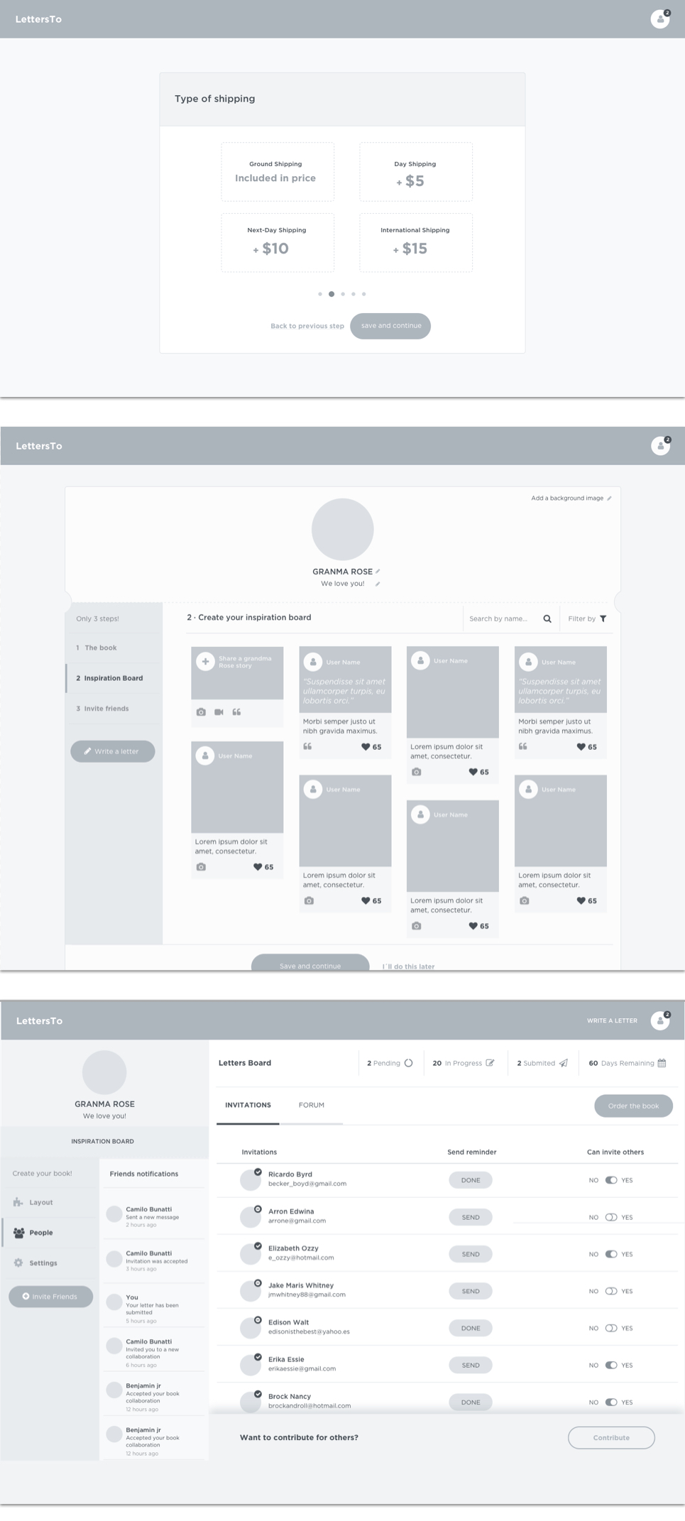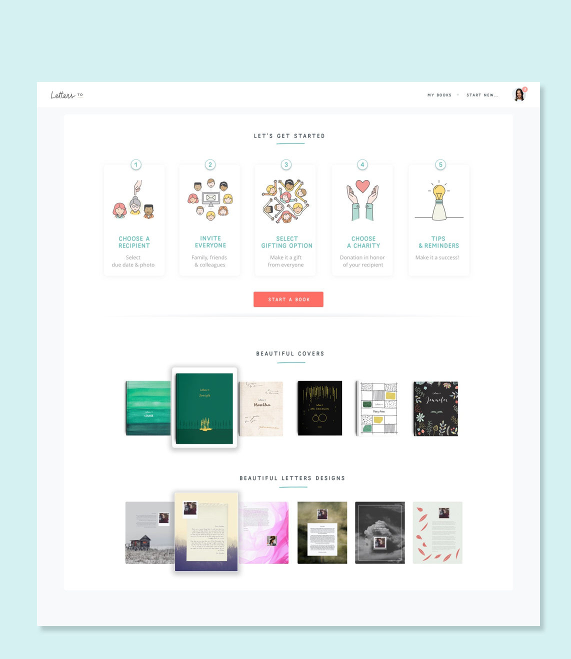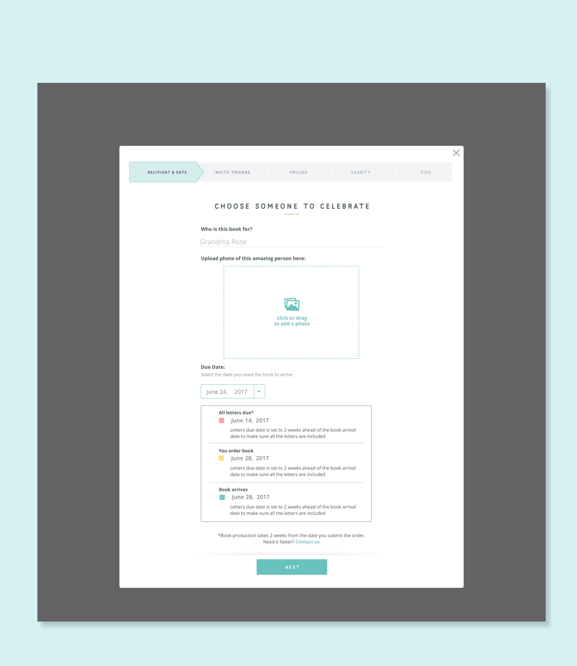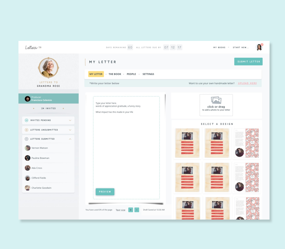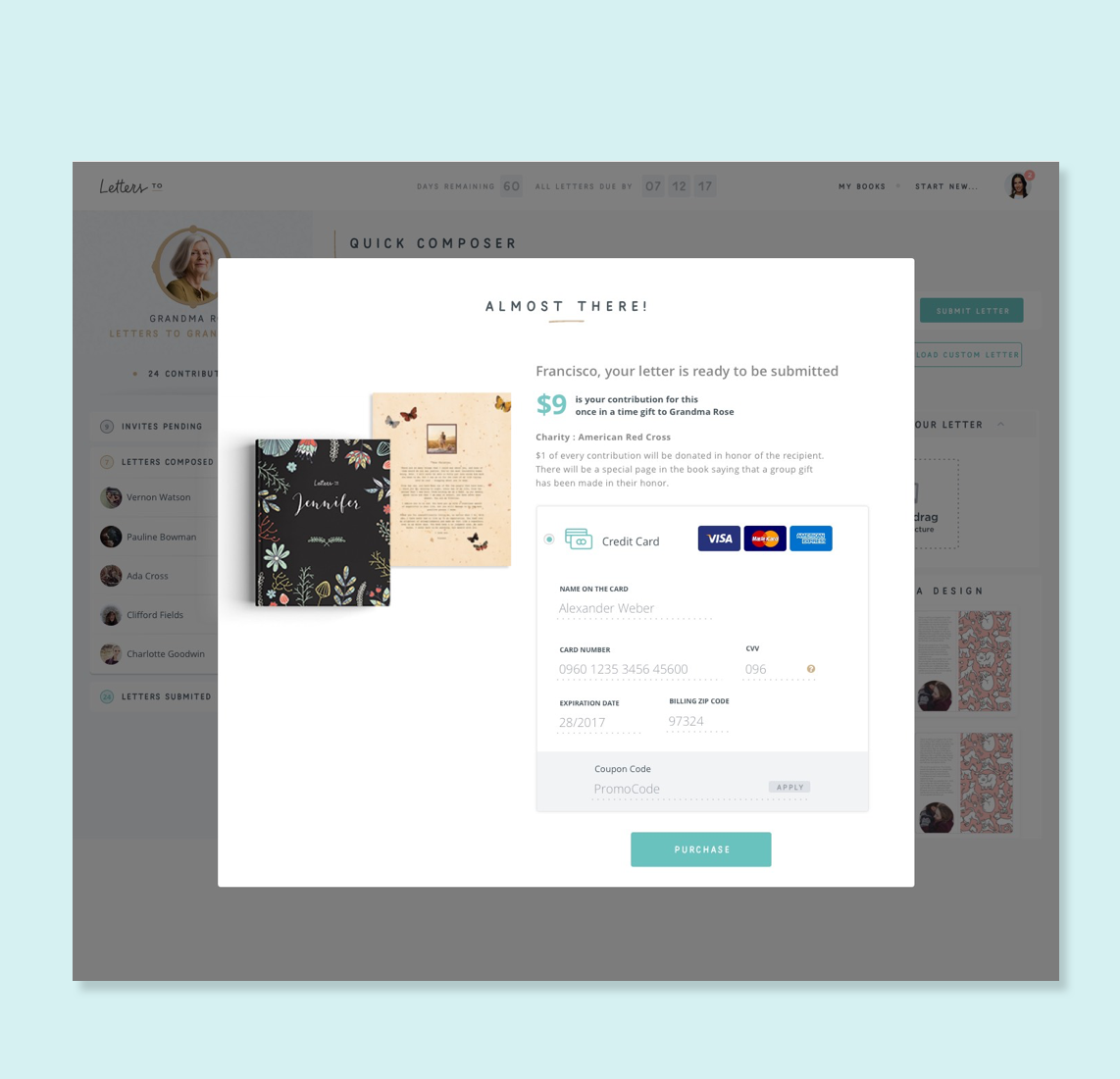

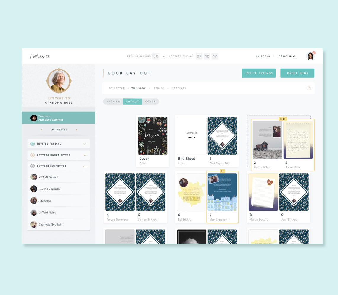
The product concept was emotionally strong. The risk was that the design would undercut it — too much friction in the flow, too little trust at checkout, no clear way for multiple contributors to coordinate. My job was to design an experience that lived up to what the product was promising people.
Working across three time zones forced a discipline I hadn't fully applied before: every design decision had to be self-explanatory without a call to explain it. If a wireframe could be misread, it would be. That constraint made the work more precise — and the handoffs cleaner than anything I'd shipped with a co-located team.
Emotional product, clear UX
The platform carries emotional weight — gifts and personal letters. The UX had to feel warm and trustworthy without becoming sentimental or unclear.
Multi-participant journeys
Letters could involve multiple contributors writing to a single recipient — requiring clear flows for invitation, coordination, and contribution tracking.
Time-release mechanics
Users needed to schedule letter delivery — selecting dates, setting milestones, and understanding when and how their recipient would receive each message.
Trust at every step
Users were creating something personal and permanent. Any friction or confusion in the flow risked breaking confidence in the platform entirely.