
Skip to content
← ING España Investment research

Investment UX research

Research-led improvements across
investment journeys

A portfolio-style snapshot of how I used research to improve investment experiences — clarity, findability and decision confidence across multiple initiatives.

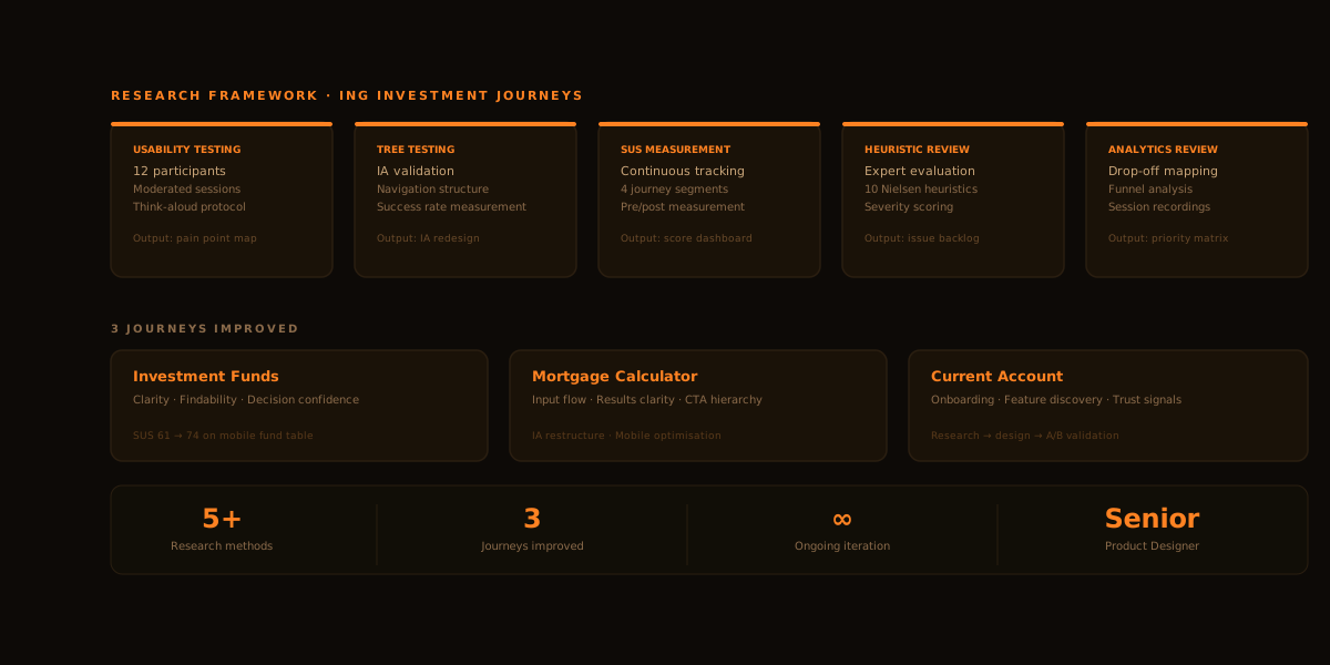
5+Research methods
3Key journeys
∞Ongoing iteration
Role
Senior Product Designer
Company
ING España
Focus
Research · IA · Usability
Read the case study

‍ What I owned

  • Planned and executed UX research across investment journeys (discovery → comprehension → decision).
  • Turned findings into actionable recommendations (IA, naming, hierarchy, content clarity) and supported iteration with stakeholders.
  • Used lightweight evaluation methods when speed mattered (benchmarking, heuristic evaluation, cognitive walkthroughs).

Glimpses of work

Each highlight shows the method, what we learned, and how it influenced changes. Enough to understand the craft — without turning this into a long report.

01

Usability testing

Moderated sessions with 12 participants across investor and non-investor segments. Think-aloud protocol.

Output Pain point map · Severity ranking
02

Tree testing

IA validation across 3 navigation structures. Measured success rate, time-on-task, and backtracking.

Output IA redesign · Navigation structure
03

SUS measurement

Continuous satisfaction tracking post-release. 4 user segments, 3 journeys tracked over time.

Output Score dashboard · Sprint priorities
04

Heuristic review

Expert evaluation against Nielsen's 10 heuristics. Severity scoring for design backlog.

Output Issue backlog · Design recommendations
05

Analytics & recordings

Drop-off mapping, funnel analysis, and session recording review across fund comparison and mortgage flows.

Output Priority matrix · Drop-off map
Result

3 journeys improved

Investment funds, mortgage calculator, and current account — each with a research-to-design-to-measurement cycle.

Ongoing Continuous loop · Iteration
Evaluative · Qualitative

Moderated interviews — comprehension test

7 participants
Goal

Identify what people misunderstood about the investment product and what information increased their confidence to decide.

What we learned

Ambiguous value signals and fee explanations created friction at decision points. People needed more tangible, comparable information before acting.

What changed

Sharper product messaging, clearer all-in fee framing, and decision-critical information repositioned closer to CTAs.

Evaluative · Quantitative

Tree test — naming & information architecture

IA audit
Goal

Validate whether the existing navigation labels and content hierarchy matched where users expected to find investment information.

What we learned

Several key sections were placed where we thought they made sense — not where users looked. Category names carried mismatched mental models.

What changed

Renamed categories using user-familiar language and simplified the navigation structure to reduce misrouting.

Evaluative · Moderated

Remote usability test — portfolio navigation

Cross-device
Goal

Validate tab and portfolio navigation patterns across devices — identifying which layout supported faster scanning and fewer errors.

What we learned

Users lost orientation between portfolio tabs on mobile. Some labels were skipped entirely; the default state defaulted to a low-priority view.

What changed

Clearer tab labels, an improved default state showing the most relevant view first, and key portfolio controls made more prominent.

Expert review

Heuristic evaluation + cognitive walkthrough

3 tasks
Goal

Identify friction and cognitive load in three critical tasks: product activation, portfolio management, and automated rule creation.

What we learned

Excess cognitive load at decision steps, missing feedback for key actions, and states that left users uncertain whether something had worked.

What changed

Improved system feedback, clearer loading and confirmation states, and progressive disclosure to reduce choices shown at each step.

Competitive · Generative

Benchmarking — product page patterns

Value & clarity focus
Focus

How do leading investment platforms explain value clearly, surface only the information that matters, and reduce choice overload at product pages?

Output

Reusable content block patterns and a simplified wireframe structure distilled from 8 competitor and best-in-class product pages.

What changed

Cleaner content hierarchy across product and landing pages, and a more purposeful "why invest" narrative that leads with user benefit rather than product features.

How research translated into improvements

Clarity

Before Ambiguous fee structures and product descriptions left users uncertain. Complex financial concepts were explained in product-first language that didn't match how users thought about investing.
After Simplified explanations, an all-in fee framing, and rewritten product descriptions anchored to user goals — reducing misunderstanding at critical decision points.

Findability

Before Navigation labels reflected internal taxonomy rather than user vocabulary. Key investment content was buried several levels deep — users routed to the wrong sections.
After Renamed categories using user-validated language, simplified IA structure, and a default view that surfaces the most relevant content first — reducing time-to-find across investment journeys.

Decision confidence

Before Key information — fees, next steps, what's included — appeared too late in the flow or was absent at the point of decision. Users hesitated or abandoned before converting.
After Decision-critical information repositioned to appear at the moment it's needed — fees near CTAs, next steps surfaced early, and "what's included" made scannable at a glance.

Lower friction

Before Critical tasks like activation, portfolio management, and rule creation suffered from missing system feedback, unclear states, and too many choices shown simultaneously.
After Improved confirmation and loading states, progressive disclosure to reduce cognitive load per step, and clearer error messages that tell users what to do next — not just what went wrong.

The thread across all improvements

Every change traced back to the same principle: make the right information available at the right moment — so users spend less energy navigating and more time making confident investment decisions.